
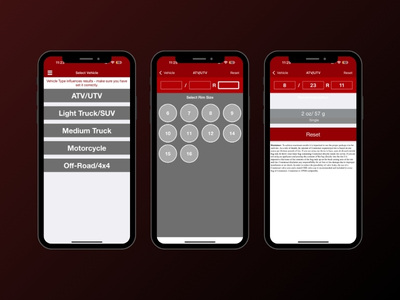
Calculator and UX
A guided flow tied to the core data layer, built to reduce errors and keep users moving.
- Input guardrails and clearer outcomes
- Customer login and profile context
- In-app training videos for the next step
Client: aftermarket autoparts consumer brand. The ask started as “just a UI refresh” for a calculator. We rebuilt it into a platform the team can actually operate: loyalty with audit trails, B2B intake that routes to sales, admin-run content, and live in-app support.
The real problem was not design. It was control: updates, loyalty operations, and lead handling were all bottlenecked behind dev work and outbound links.
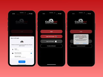
The calculator did its job, but it ended the moment someone needed the next step. Users clicked out, the team lost context, and simple changes became “open a ticket.”
We kept the calculator at the centre, but rebuilt everything around it so the experience continues inside the app. The result: fewer drop-offs, more controllable content, measurable loyalty, and leads that arrive with context.
A guided flow tied to the core data layer, built to reduce errors and keep users moving.
The team can change what customers see without waiting on dev.
Rewards that can be operated and verified, not “trust-based.”
Dealer and distributor requests captured inside the app and routed automatically.
Real-time in-app chat that keeps customers in the experience.
Same identity and points across mobile and desktop.
This is where the “platform” part shows up. Marketing, ops, sales, and support each get a workflow that does not depend on a developer to keep moving.
Callout: routine updates stopped being dev tickets.
Public milestone noted by the brand: 10,000 plus app users (from their LinkedIn post).
With the core platform in place, the next phase focuses on extending the same workflows to desktop and tightening the dealer lifecycle.